Product & Design
Arabic interfaces: why mirroring an English design does not work
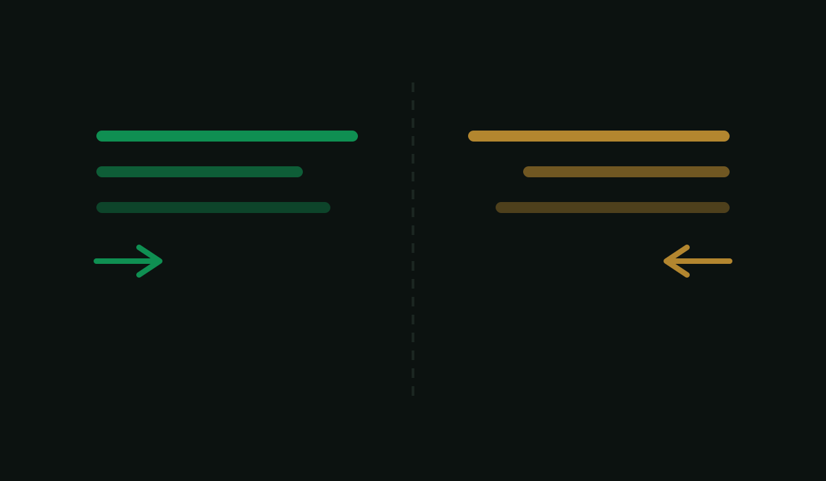
An Arabic interface is not an English one flipped. Teams that treat RTL as a late-stage translation task lose months, and the result still feels foreign to the people using it.
What actually has to change
Direction is structural. Layout, navigation, icon direction, progress and form flow all reverse. Modern CSS logical properties handle much of this — if the stylesheet was written with them from the start. Retrofitting a codebase full of margin-left is the expensive path.
Mixed direction is the hard part. Arabic text containing a Latin brand name, a URL, a phone number or a price is bidirectional, and getting it wrong produces sentences that are subtly scrambled. This is the single most common defect in Arabic interfaces.
Numbers and dates. Arabic-Indic or Western digits? Which calendar? These are product decisions with regional answers, not defaults to inherit.
Typography. Arabic needs more line height than Latin at the same size, and a typeface with real Arabic metrics — not a Latin face with a fallback attached. Weights rarely map one to one.
Not everything mirrors. Media playback controls, and anything depicting real-world direction, generally stay put. Mirroring them is a common and jarring error.
Translation is not localisation
Machine translation produces text that is grammatical and lifeless. Arabic also has a register problem: Modern Standard Arabic reads formal and correct; dialect reads human but does not travel across markets. Which one you choose is a brand decision.
Decide it at the start
Design both directions from the first screen. Choose the typeface pair before the design system. Build with logical properties. Test with real content, including the long words and the mixed-direction strings — never with placeholder Latin text.
Every product we build ships Arabic and RTL from the first screen. That is what we do.